Every few years I hit a wall with my portfolio. Not because the projects changed, but because the way I present my thinking does.
Version 3 was clean: a dark single-page layout, floating nav, project cards, PDF CV link. It did the job. But it felt like a brochure. Static. You scrolled, you read, you left.
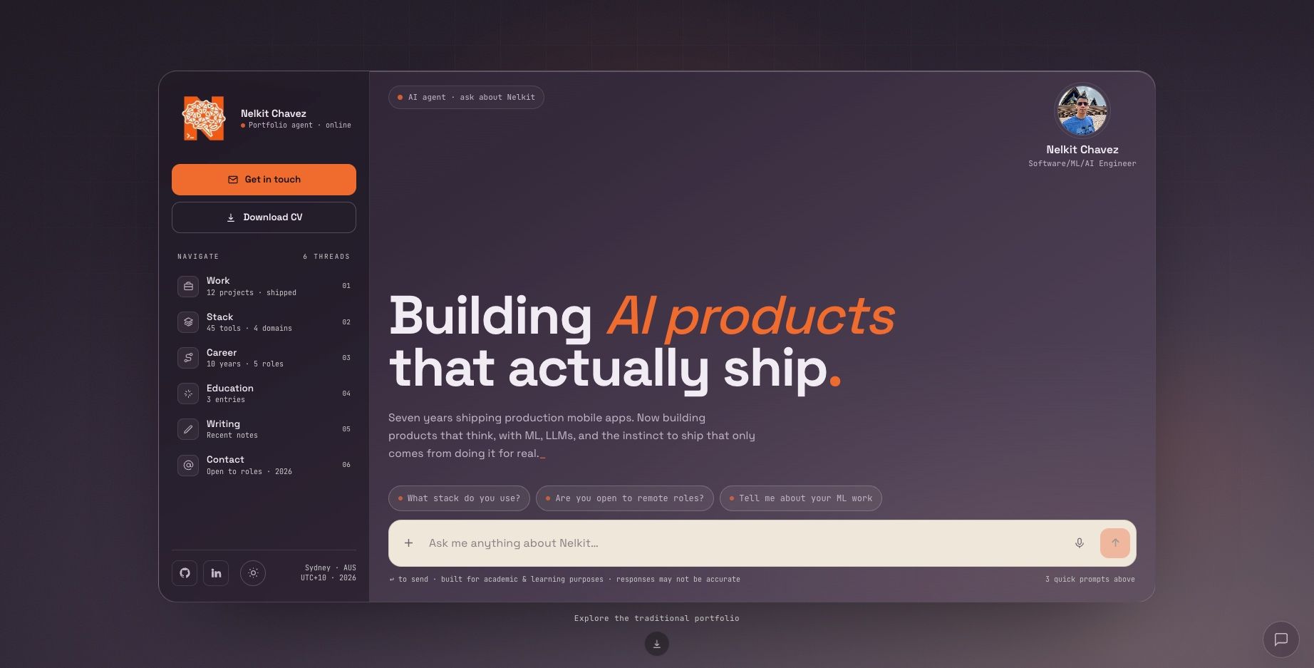
V4 starts with a different question: what if instead of a visitor reading about me, they could just ask?
The Core Idea
The hero is a framed chat panel. You can ask about my stack, my ML work at UTS, whether I am open to remote roles. The AI agent is the interface, not bolted on top, not a "contact me" replacement. It is the first thing you encounter.
The interaction pattern forces a shift: you navigate by curiosity, not by scrolling past sections you do not care about.
Building this the right way meant solving several non-trivial problems on the backend. Here is what actually mattered.
Stack
- Framework: Next.js 15 (App Router, React 19, TypeScript 5)
- CMS: Strapi v5 on Strapi Cloud. Content types: Home Page (singleton), Projects, Blog Entries, Skills, Career Entries, Education Entries
- AI Chat: Vercel AI SDK v6 (
ai@6,@ai-sdk/react) + OpenRouter as LLM proxy
- LLM models:
openai/gpt-oss-120b(primary, cheap) andopenai/gpt-oss-120b:free(free fallback when credits run out)
- Agent knowledge base: Notion API (
@notionhq/client). A single page with my full professional profile, cached in memory for 10 minutes
- Markdown rendering:
react-markdownfor agent responses
- Deploy: Vercel (serverless functions + ISR)
Backend Architecture
ISR with a Strapi-resilient cache
Strapi Cloud occasionally returns 503s during cold starts or under load. If your revalidation window hits one of those moments, a naive implementation propagates the error and serves a broken page.
The fix: fetch() with next: { revalidate } delegates caching to Next.js's Data Cache layer. If Strapi is down during revalidation, Next.js keeps serving the last valid cached response instead of crashing. Revalidation windows are tuned by content type: 24h for static pages (home, projects) and 1h for blog. The site stays functional even when the CMS is not.
Content fully decoupled from code
Every piece of content comes from Strapi via REST API, with qs for typed query strings. Nothing is hardcoded in the frontend. If Strapi returns nothing for a section, that section simply does not render. No placeholder copy, no empty cards. This is better for SEO than showing stale fallback data and it forces the CMS to be the real single source of truth.
Dynamic SEO per route
Each dynamic route (/blog/[slug], /projects/[slug]) exports generateMetadata that fetches data from Strapi and generates specific Open Graph and Twitter Card tags per page. Worth noting for Next.js 15+: viewport must be exported separately from metadata. Combining them throws a build warning that eventually becomes a hard error.
The AI Layer
This is where most of the interesting engineering decisions live.
OpenRouter as LLM proxy
Rather than wiring the frontend directly to a single model provider, the chat API route goes through OpenRouter. This gives a single endpoint that can route to any model, which matters when you are working with cheap and free-tier models that have inconsistent availability.
The primary model is openai/gpt-oss-120b: fast, cheap, good enough for Q&A about a professional profile. The fallback is openai/gpt-oss-120b:free, which costs nothing but has stricter rate limits.
Automatic model fallback without user-visible errors
OpenRouter returns 402 when credits are exhausted and 429 on rate limits. Without handling these, the chat just breaks silently. The server-side route catches both codes and retries automatically with the free fallback model. The user sees a slight latency increase; they never see an error state.
This is intentional. The point of the portfolio chat is demonstrating how to build resilient AI products, not how to demo them under ideal conditions.
Notion as the agent knowledge base
The agent does not have hardcoded answers about me. Instead, on each request the server fetches a structured Notion page that contains my full professional profile: background, projects, skills, academic work, open-to-work status. This is injected into the system prompt.
The Notion page is cached in memory for 10 minutes. Refreshing it is a content edit in Notion, not a code deploy. That separation matters: the knowledge base can evolve independently of the application.
Using @notionhq/client the fetch is straightforward, but the result needs preprocessing. Notion's block structure returns rich text, lists, and headings as nested objects. A lightweight serializer flattens that into clean markdown before it goes into the system prompt. Raw Notion JSON in a prompt wastes tokens and confuses models.
Context window management
The system prompt with the Notion knowledge base is substantial. A full conversation history on top of that exceeds the context window of cheap and free models very quickly.
The solution: only the last 6 messages are sent to the model on each request. The system prompt is always included; the conversation history is trimmed from the oldest end. This keeps costs predictable and responses fast without the user noticing degradation.
It is not a perfect solution. The agent can lose the thread of an earlier specific question. But for exploratory Q&A about a professional profile, it is the right tradeoff. The use case does not require deep conversational memory.
Honest caveat: the agent uses cheap and free models on purpose. Responses can be imprecise or miss nuance. The goal is demonstrating the architecture and interaction pattern, not production-grade accuracy. If you need to verify something specific, my LinkedIn and GitHub are right there.
useChat and the reset problem
Vercel AI SDK v6's useChat hook manages conversation state internally and does not expose setMessages for a full reset. To implement "New Chat", the parent component holds a numeric chatKey. Incrementing it forces a full remount of the chat component, which clears all internal state cleanly.
It is a pattern worth knowing: if a hook manages internal state you cannot reach via its API, controlling it through React's key prop is the cleanest escape hatch available.
Cross-component agent communication
The portfolio has a floating action button that lets visitors fire quick questions at the agent from anywhere on the page. The problem: the FAB and the chat panel live in completely different parts of the component tree, with no clean shared parent for a context provider.
The solution: the chat component registers window.__askAgent in a useEffect. The FAB calls it and scrolls to the top. It is a deliberate escape hatch, not a pattern for a production app, but appropriate here because the registration is tied to the component lifecycle and the interface is single-page.
What is Next
The Notion knowledge base will expand with more project detail and academic work from my Master's in Data Science at UTS. The blog is live now. Expect posts on ML project architecture and applied AI decisions.
The agent will improve as the knowledge base grows. For now, it is an honest demonstration of the pattern: a conversational interface powered by cheap models, a structured external knowledge source, and enough engineering around it to make it feel seamless.
If you want to dig into the implementation or talk architecture, reach out via the Contact section.
Built with Next.js 15, Strapi v5, Vercel AI SDK v6, OpenRouter, Notion API. Deployed on Vercel. Source code on Github Repo.