Interactive data narrative examining the growing tension between housing affordability and public transport access across Australia's 8 capital cities from 2020 to 2025, built for policy makers using real ABS and BITRE data.
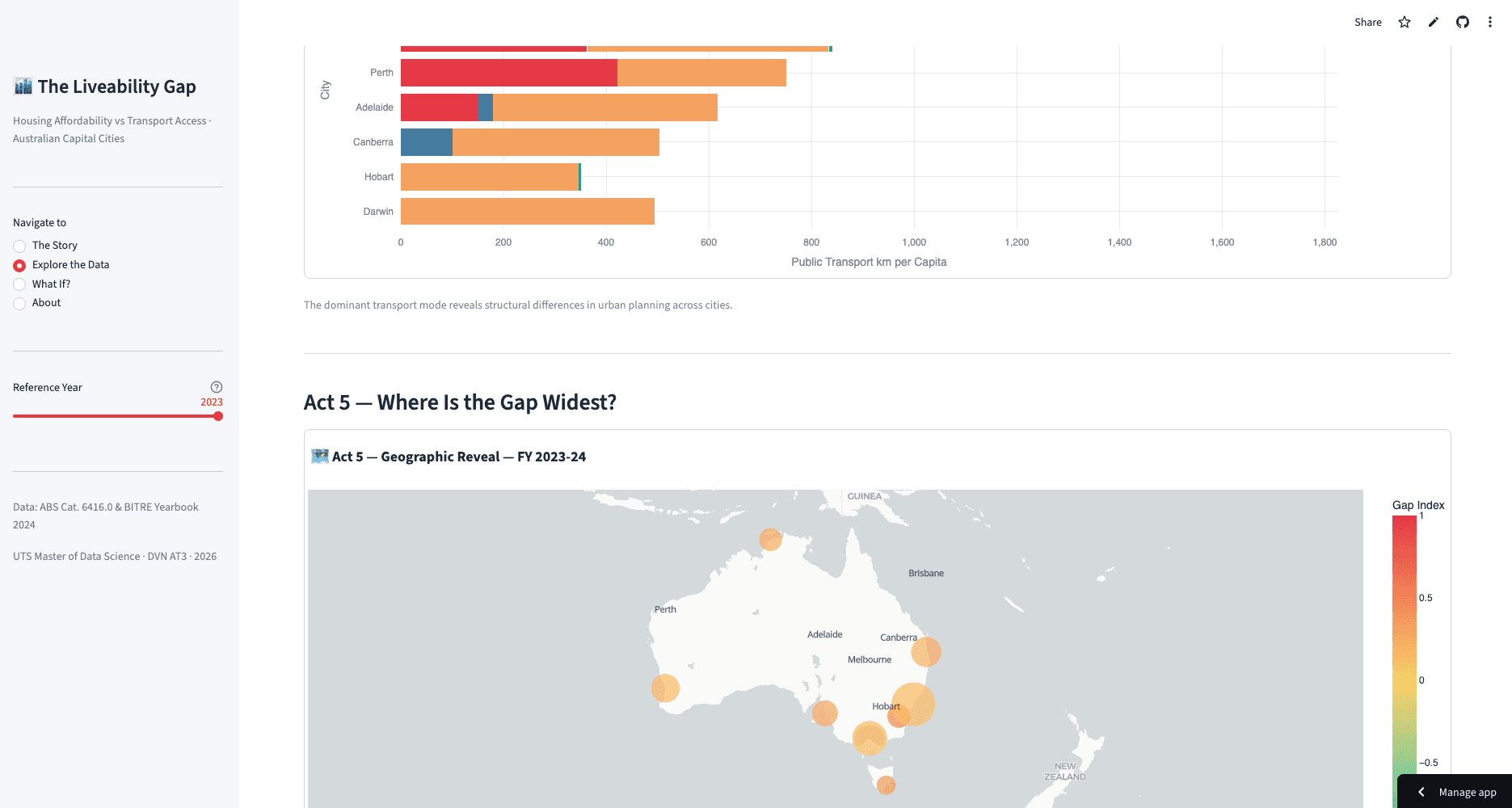
Built for the Data Visualisation & Narratives subject at UTS as a group project, this Streamlit application tells a data-driven story about one of Australia's most pressing urban policy challenges: the widening gap between where people can afford to live and how well those areas are connected by public transport. Using median dwelling price data from the ABS and transport patronage statistics from BITRE, the app guides policy makers through an interactive narrative across all 8 Australian capital cities covering 2020 to 2025.
The application implements the Sparkline narrative arc — highlighting the gap between "what is" (current data) and "what could be" (the policy goal) — with context-aware filtering, scrollytelling layout, and what-if parameterisation as advanced features. Built with Streamlit and Plotly, the dashboard follows human-centred design principles including Gestalt visual hierarchy, pre-attentive attributes, and high colour contrast accessibility standards.
